Design
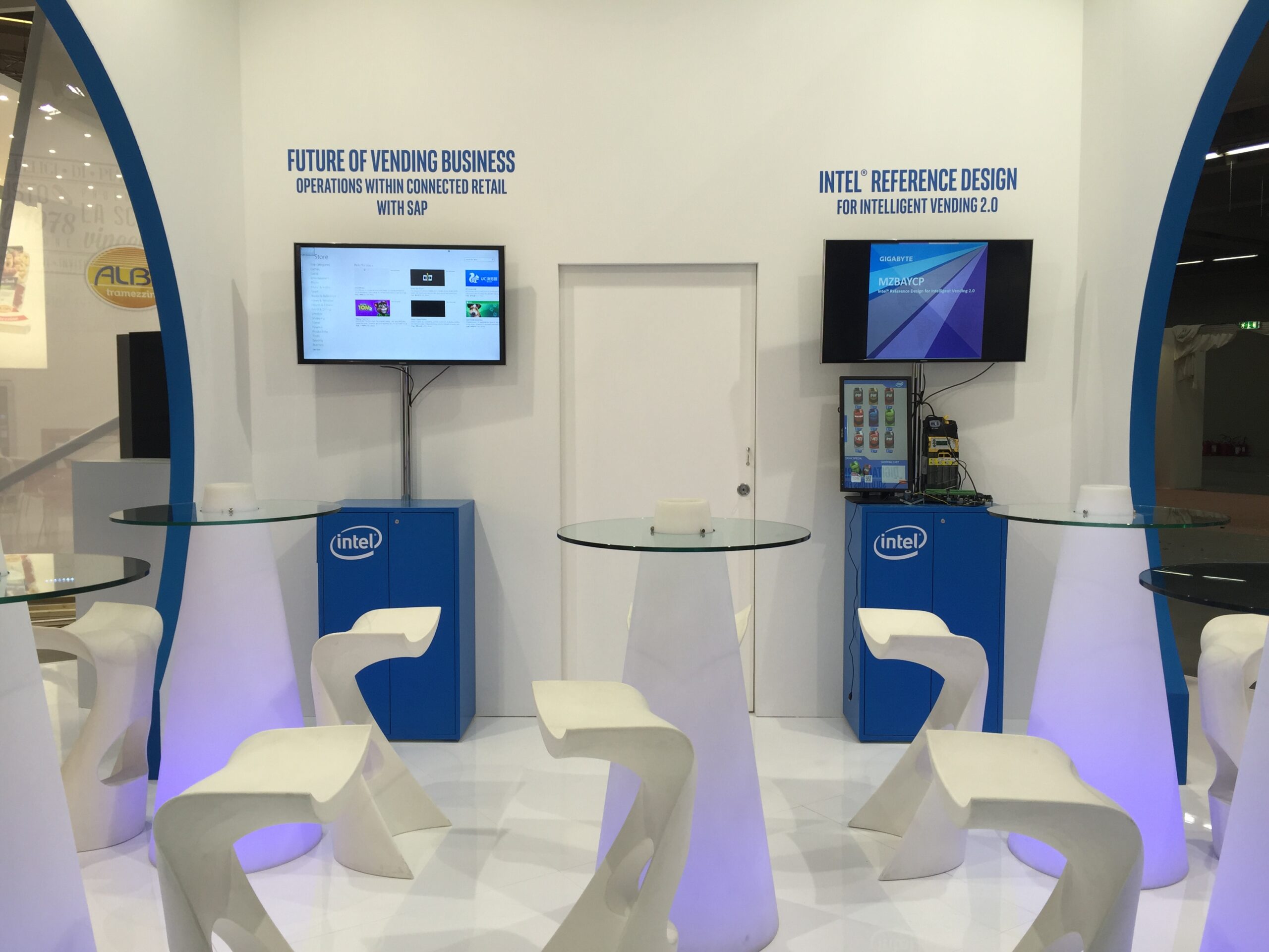
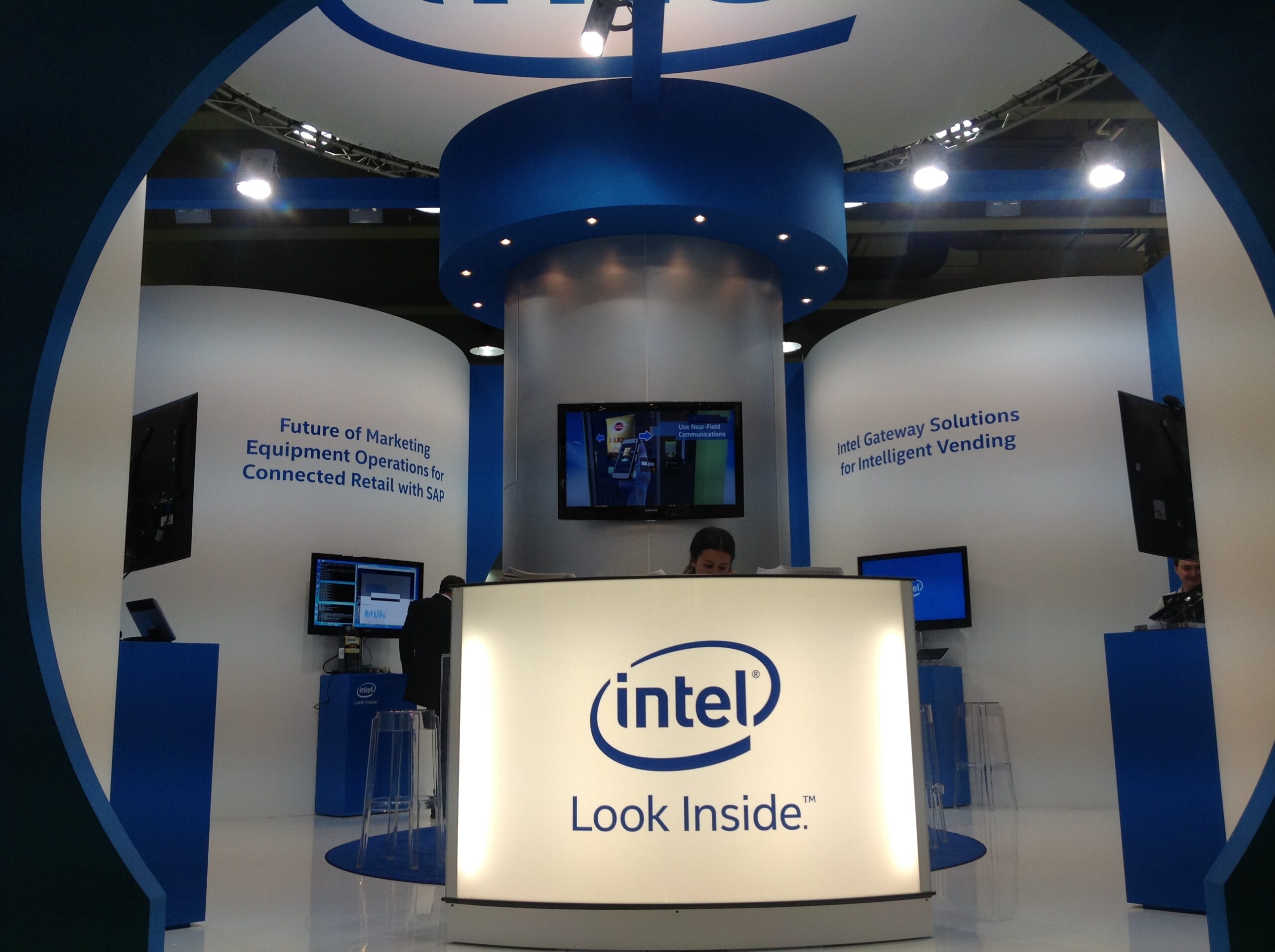
The design phase of the Intel stand witnessed a great effort by our technical staff. They managed to create an easily usable space that bears testimony to a high aesthetic standard. Vending machines that needed to be included inside the stand posed a challenge, as they are particularly heavy and bulky. Despite this, our team managed to position them harmoniously and tactfully.
Curved lines
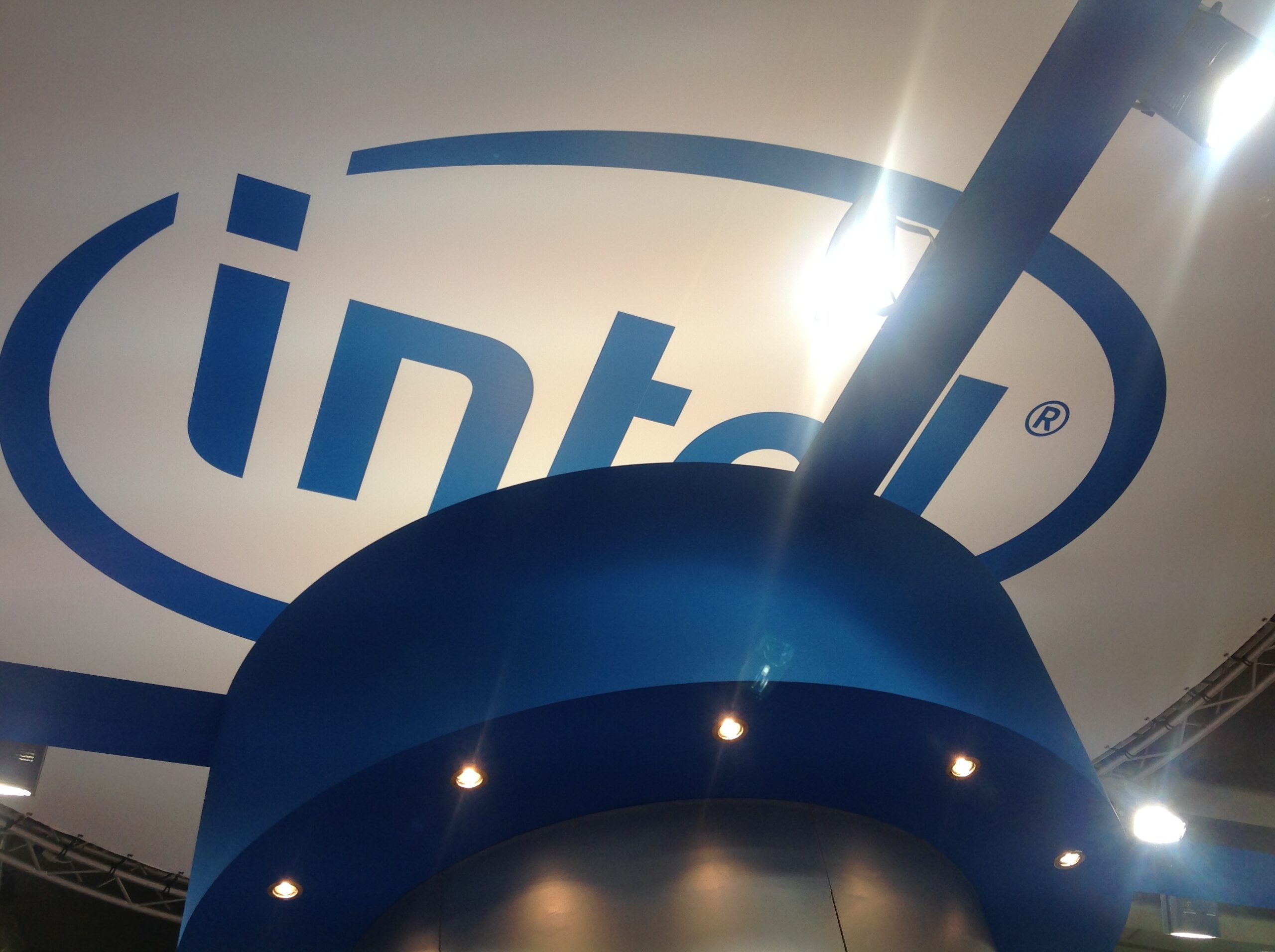
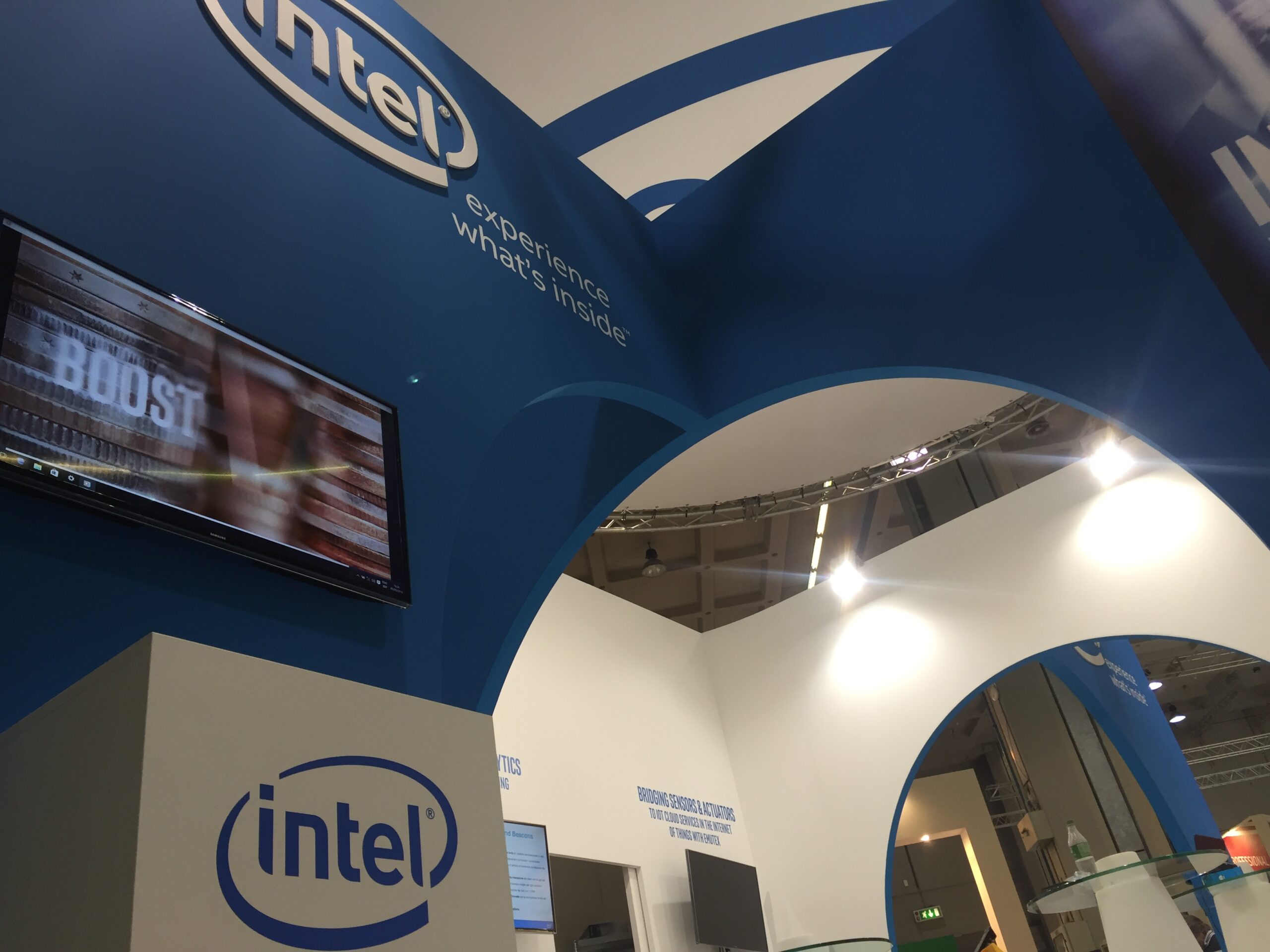
To contrast the imposing volumes of the machines on display, we designed the stand with curved lines repeated in all details: an eight-meter diameter light bridge adorned with the Intel logo dominated the entire space, a central column that served as storage space, curved lines that embraced the machines, and arches to allow the entrance to the internal area.
Images
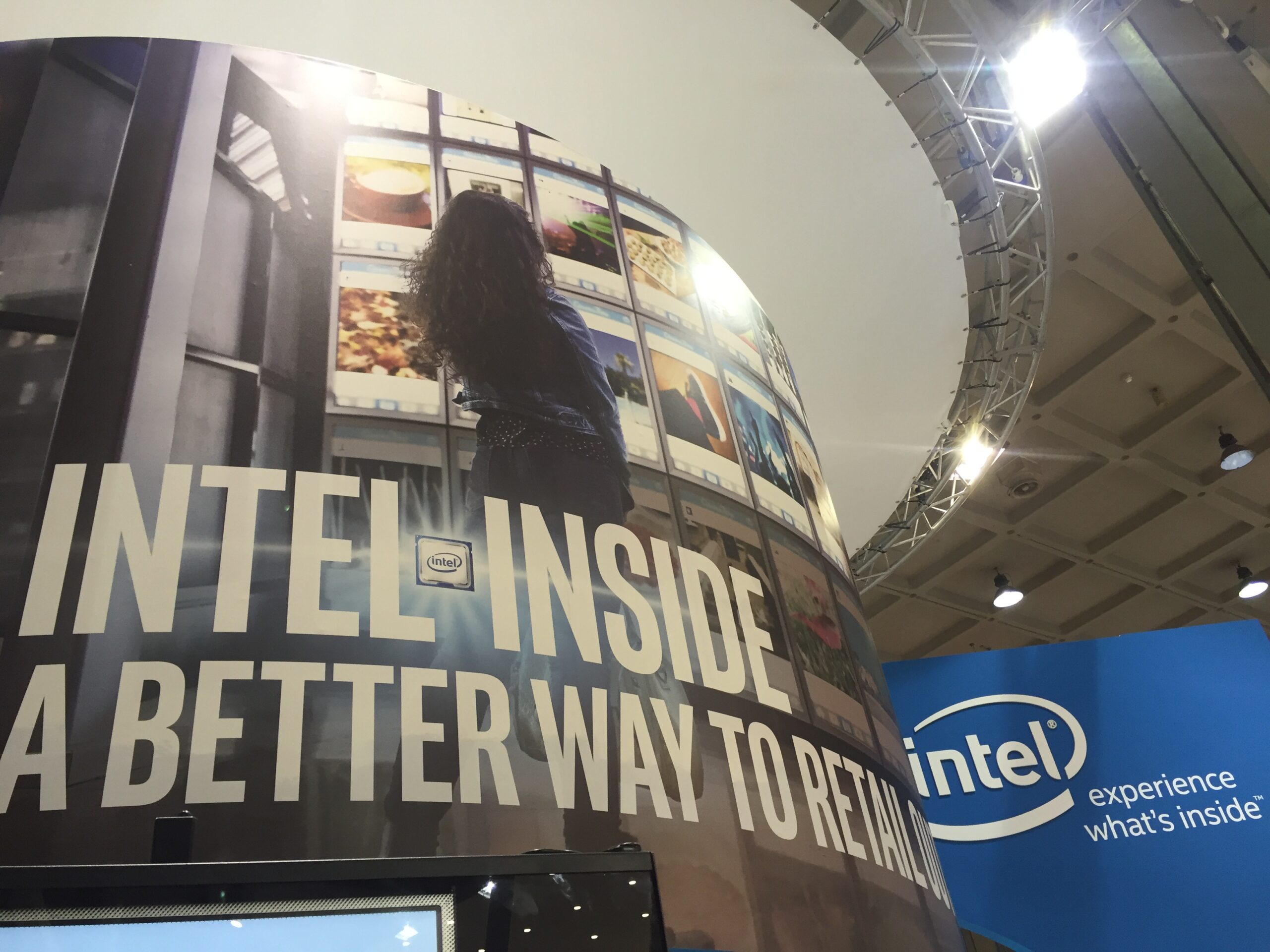
Externally positioned large images represented a fundamental feature for the communication of the client’s message. A highly appreciated detail by the client was the creation of a tab raised on the four sides of the stand leaving a view of the electronic circuits below.
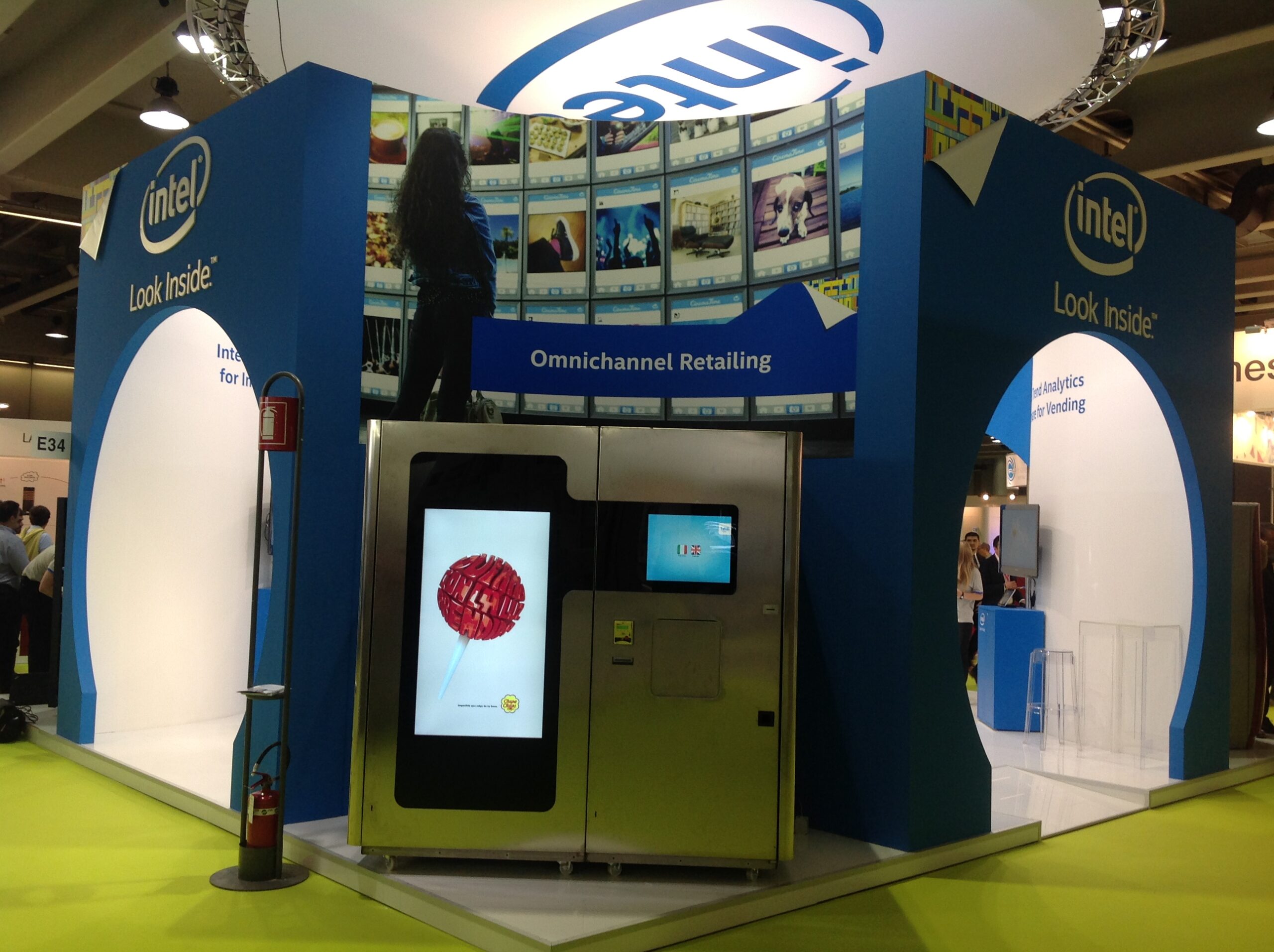
Venditalia is the most important international event in vending machine industry, both in terms of exhibition area and the number of visitors.
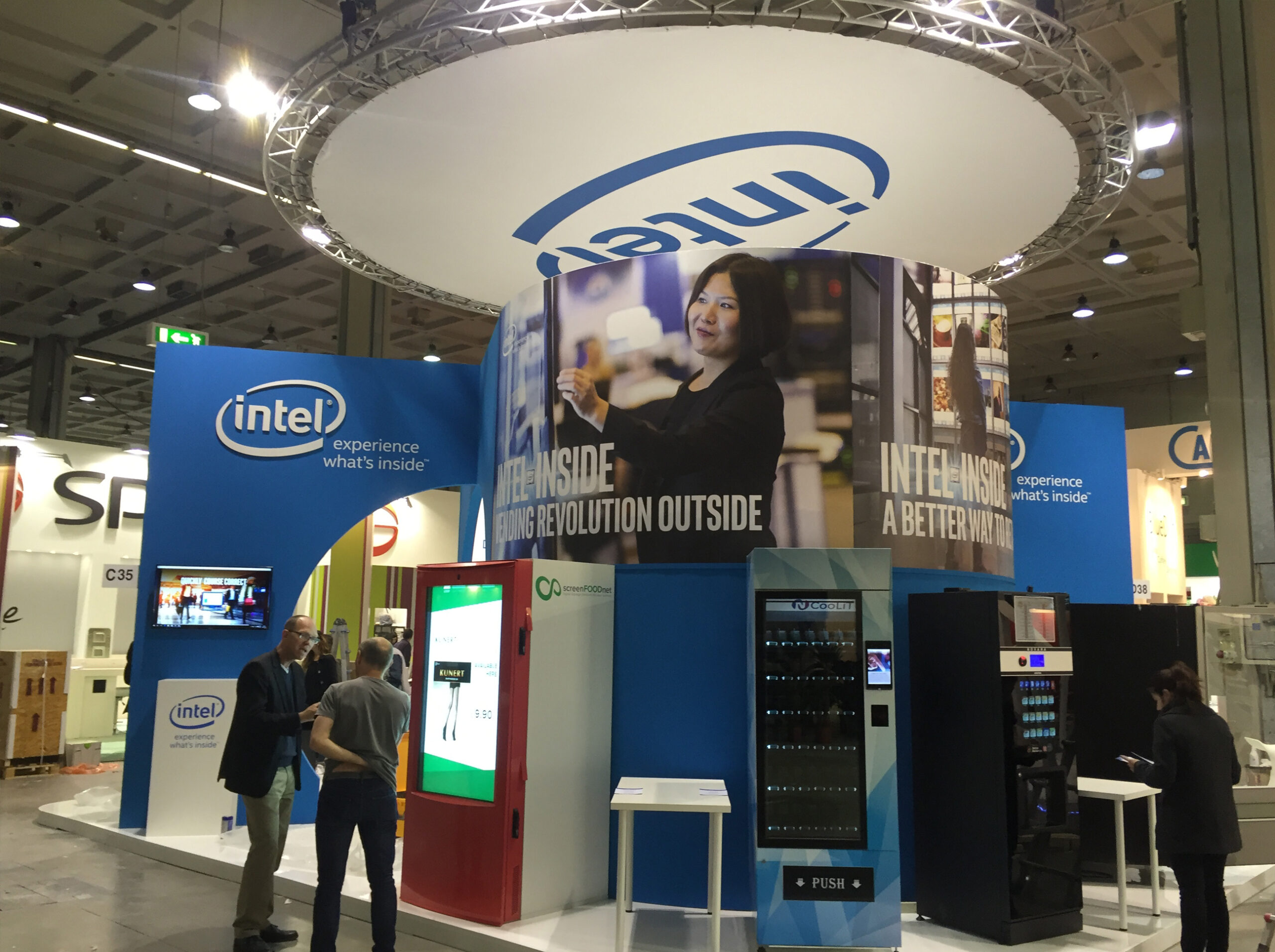
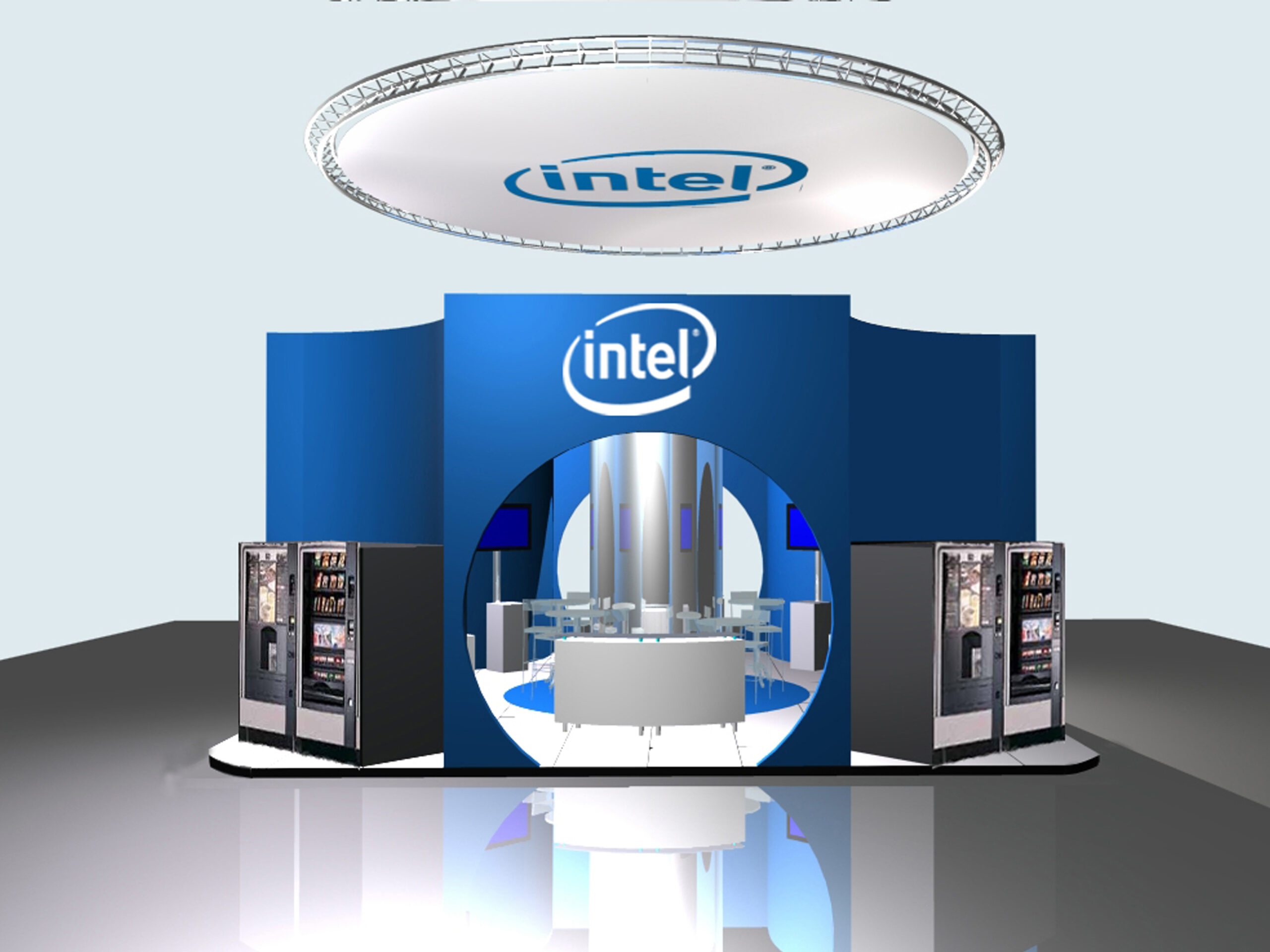
We studied the stand down to its details. the central column was scrutinized and designed as a storage space. The latter was realized and finished in silver to emphasize the modernity and technology of the brand.
