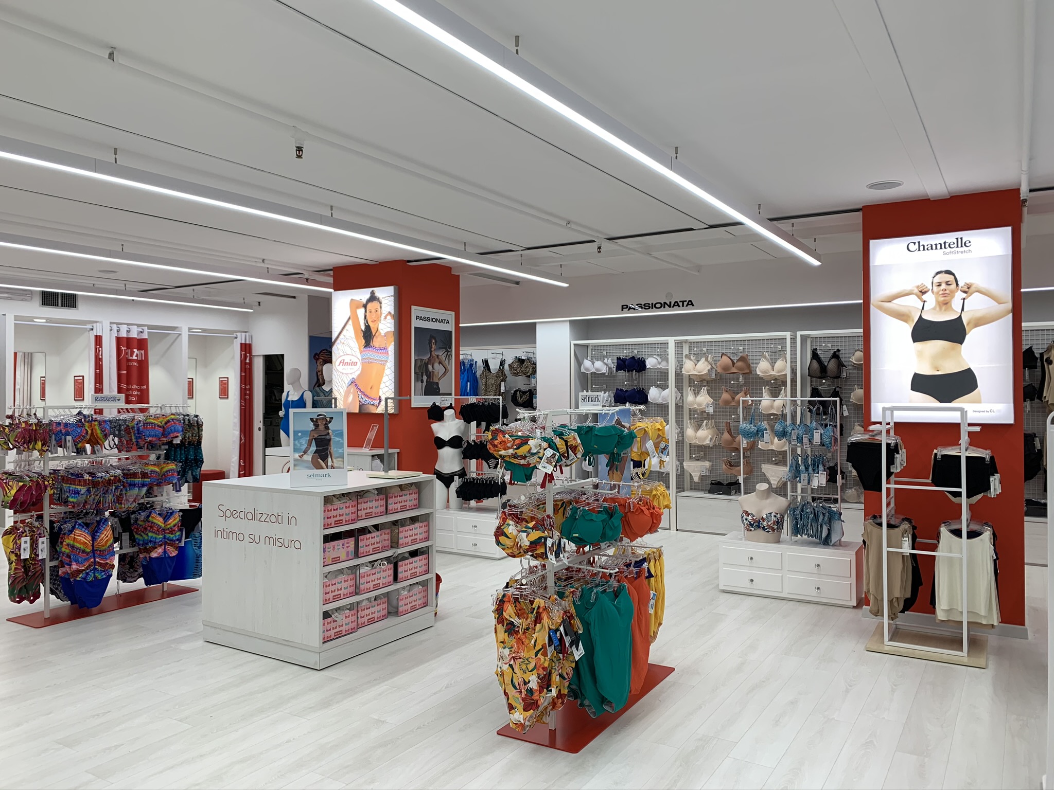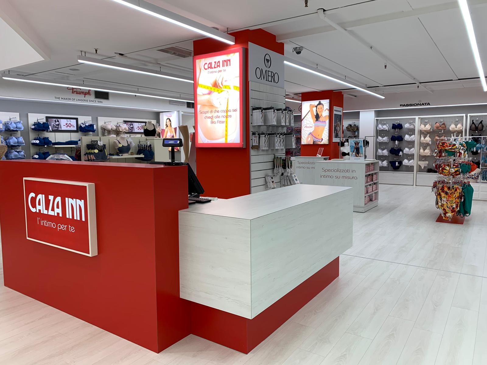
The project
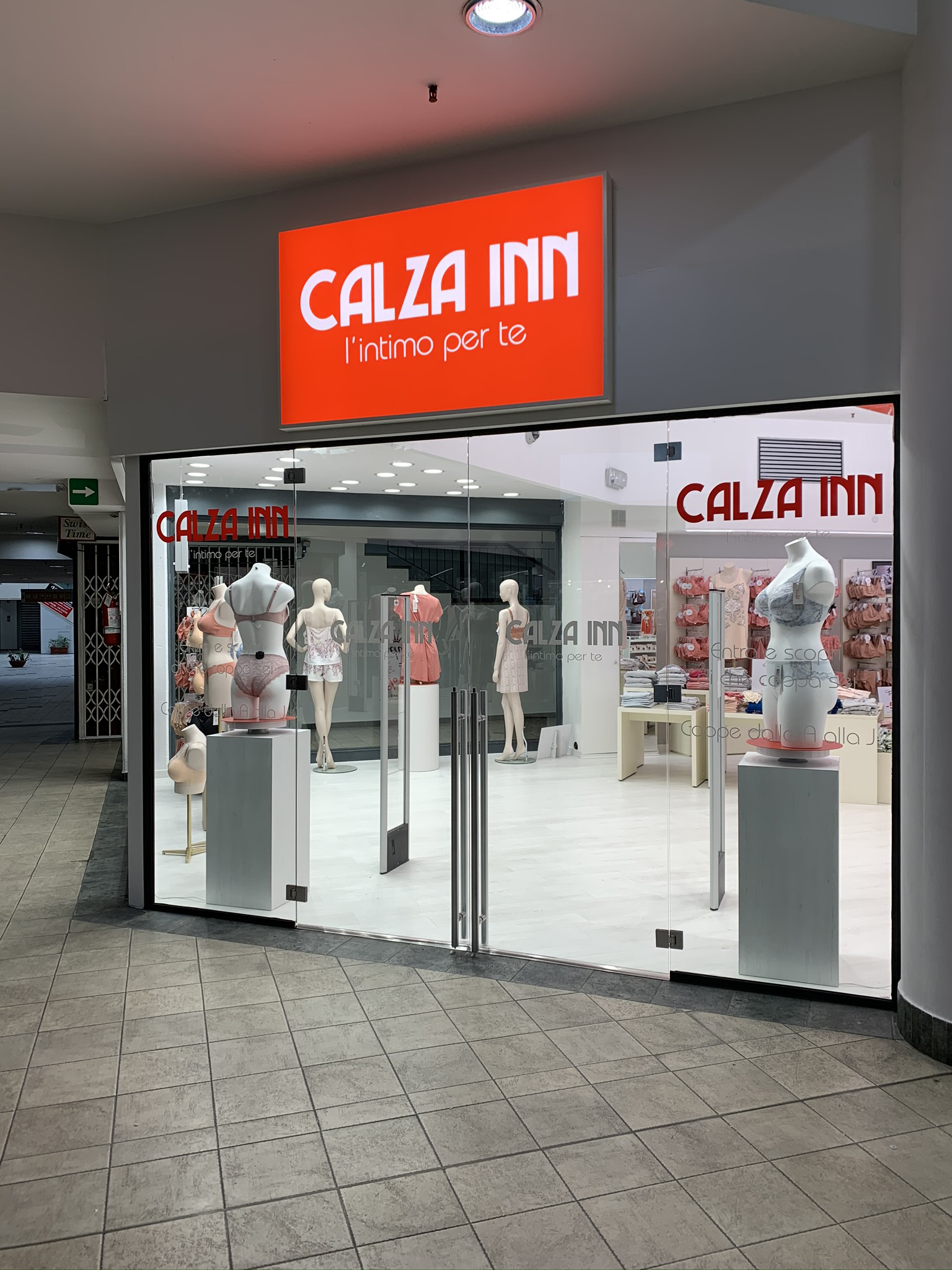
Calza inn store project was part of a full renovation of the store. Roostar team took care of space planning, creating exhibition and storage areas, as well as dressing rooms and shop windows.
Creating logo
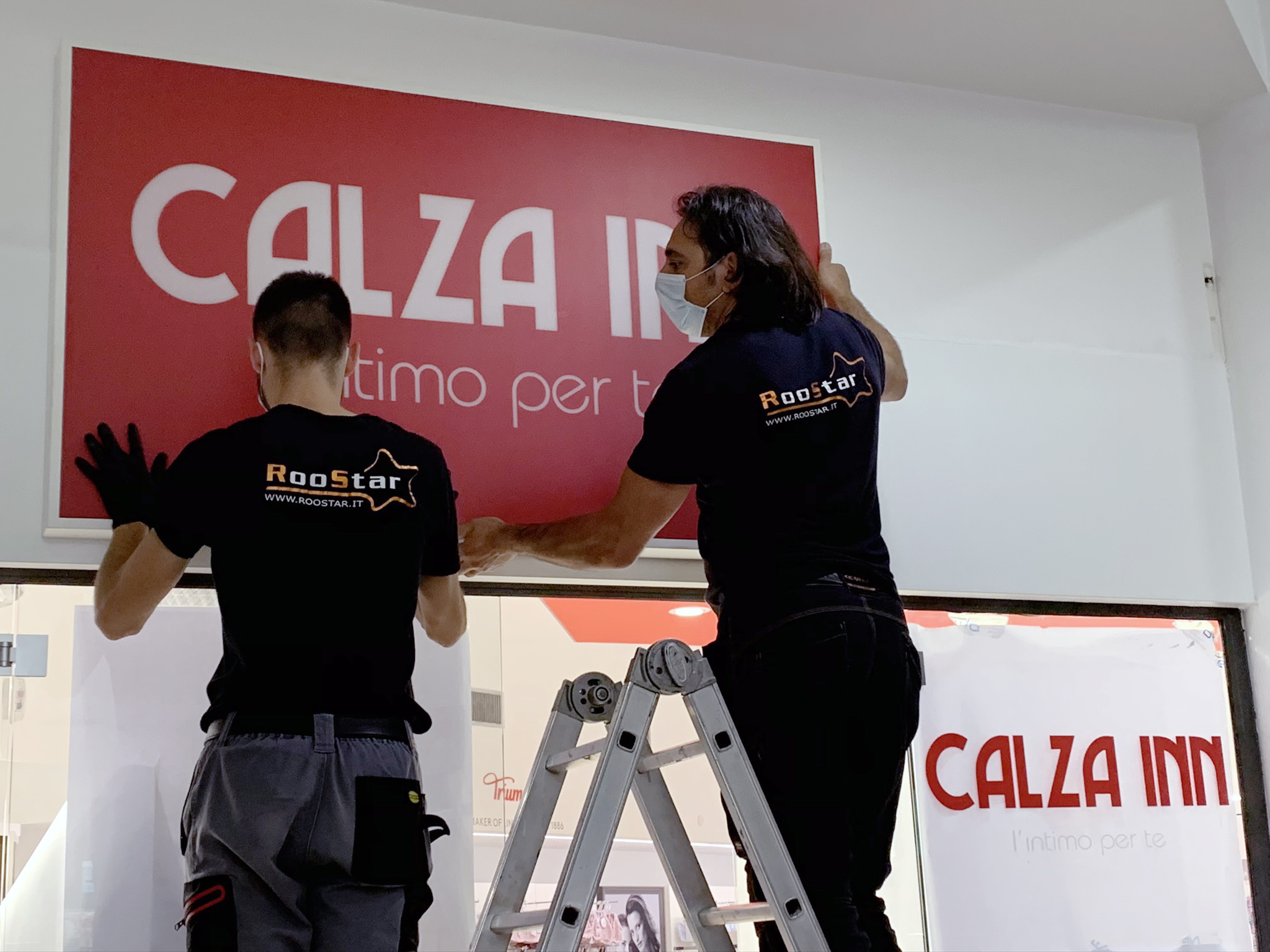
Roostar took care of the restyling of the logo too. The original logo pertains to varese and is considered iconic. Our restyling met the specific needs of our customer and and at the same time it was captivating and helped to immediately understand what the product category for sale in the store was.
Forniture and exhibition structures
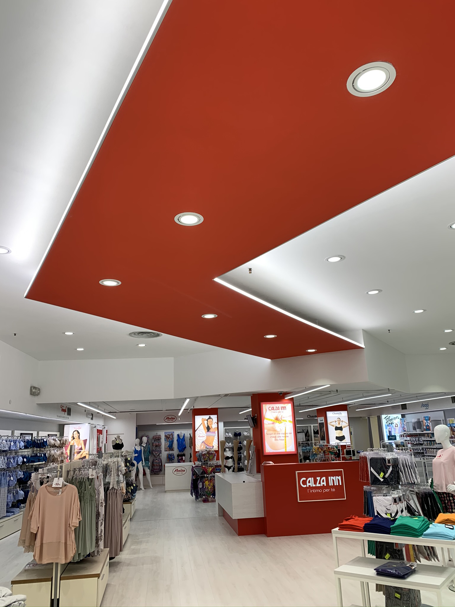
Roostar also took care ro the whole design and construcyion of the forniture. In particular, the cash desk was completely customized according to the customer’s needs. Display were designed to combine maximum connectivity with aesthetics and modularity. This was a coordinated project that combined usability, functionality and multiplicity of the brand.
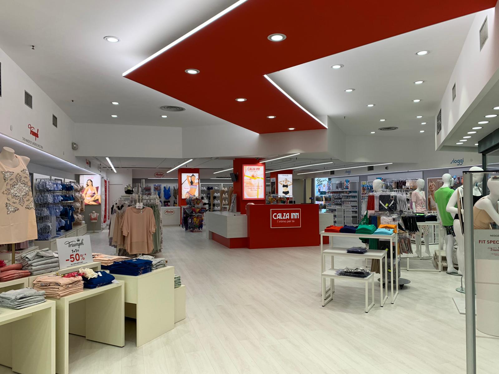
Designing this project, we aimed at emphasizing two elements that were strongly distinguishable: the cash desk and the false ceiling. This overhead element emphasized by edge- surrounding blades of light invites the costumer into the exhibition area and accompanies him along the way.
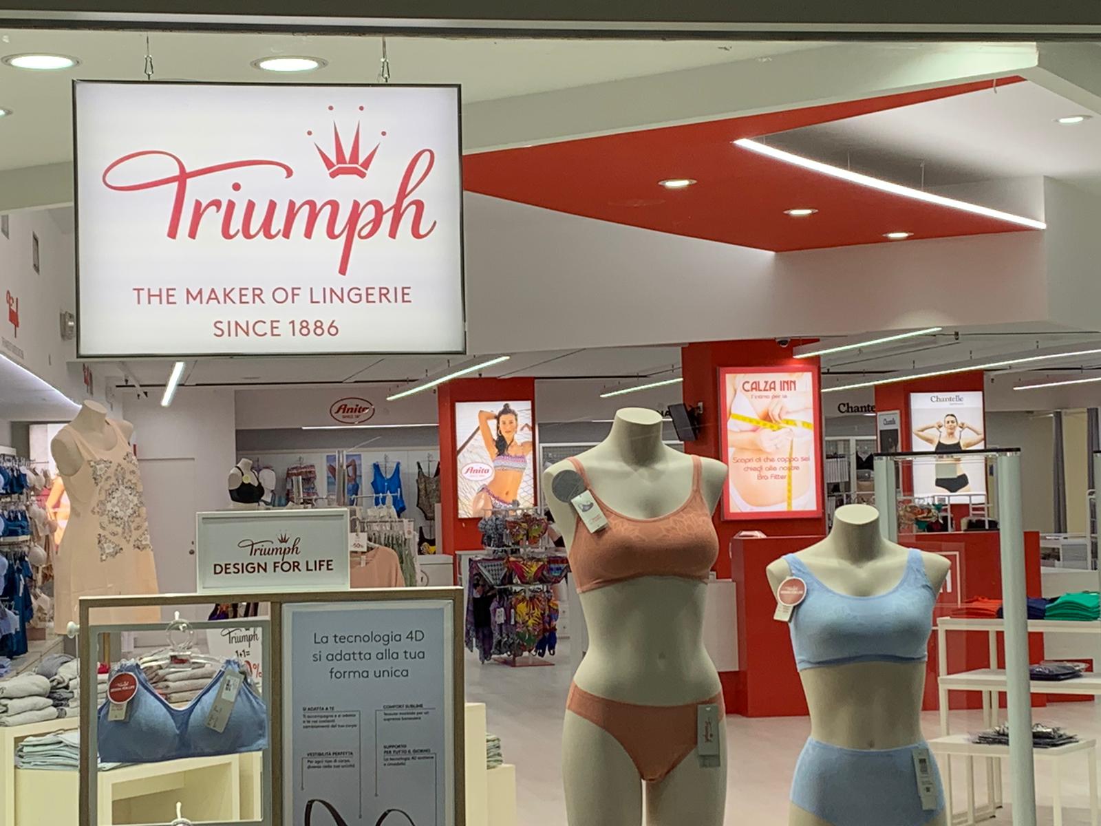
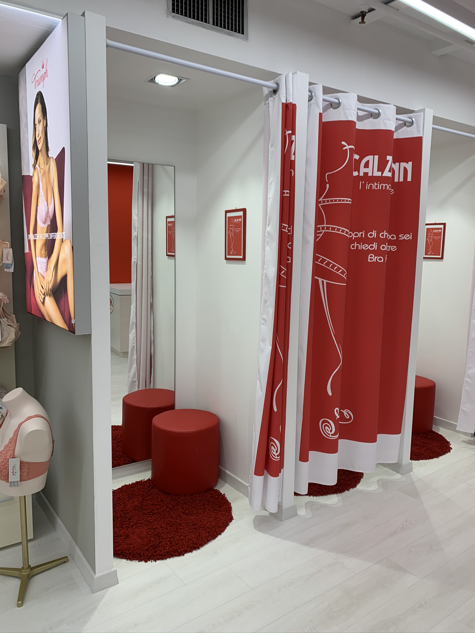
Another strong feature of the store design, which gives full exposure to the brands is the display panels that emphasize each of them as they look out to the front. In this multi-brand space, we chose to make the shop windows for each brand, highly distinguishable by using luminous items. Also, in this case we wanted to combine aesthetics and flexibility using systems that make the change and maintenance of images easy.
